ATG Case Study Banner

UI/UX Case Study for Across The Globe

By Banao | Dec 17, 2021

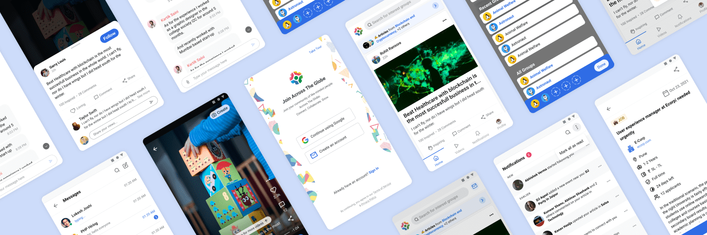
Across The Globe (ATG) is a social networking platform that brings individuals from all around the globe together to connect and collaborate. Make a connection with others that have similar interests or career fields to you.

ATG helps you look for internships, jobs, and get answers to your questions, in addition to building connections. ATG also allows you to find a group that is related to your pursuits. You can learn about a career fair or other related events. We at ATG can also assist you in broadening your horizons of knowledge because the professionals on our platform write articles in fields in which they excel, which you can access.

    Achievements

    Achievement

    50,000+

    Play Store Downloads

    Achievement

    15,000+

    Users in 2021

    Achievement

    10X

    Retention on Platform

    Challenges

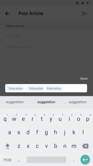
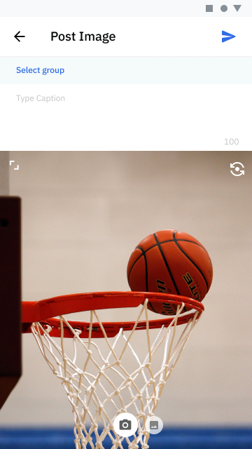
    People are more likely to stay on a website if the UI/UX is good. Identifying the issues was the first step. Some of the flaws we encountered were applying for internships directly from the post, in publishing an article, and in managing the jobs we had already applied for.

    Work Image
     Work Image Work Image

    Across the globe before redesign

    How we made ATG more user-friendly?

    Switched away from the green

    Switched away from the green

    After research, we chose the color blue as the primary color for the platform as it was more calm, peaceful, and easy. Following the color theory, we added some contrasting colors to blue for our backdrop. We also kept in mind not to overuse blue. We maintained the subtlety. Yet with all the embellishments, we kept the overall design simple for the users.

    Made sure that the UX had a smooth flow

    Made sure that the UX had a smooth flow

    We tried to place every action one or two clicks away, and every destructive action such as ‘delete’ two or more clicks away to avoid the user’s mistakes. We checked the text legibility on all major devices. We wanted our website to cater to all kinds of users and not just users with super-tuned monitors. With a much smoother flow, the user can apply to jobs right from the home screen. Users can reach their profile page in a single click as it was a three-click thing previously.

    Enhanced the hierarchy

    Enhanced the hierarchy

    In the old page setup and design, too many things were catching the user’s attention. Now it was easier for the users to scan the page. We simplified the content and made sure the star content has better visibility. We structured the elements in the order that we wanted them to see. We took care of Typography, Contrast, Shadows everything and made it a pleasant experience for the users.

    New salient features to the rescue.

    New salient features to the rescue.

    We added some new features for students and professionals on the platform. We added a hiring dashboard for the employers to track and manage the applications right on the platform. and added easy apply for the students so they can apply on the opportunities with just a single click. We added a one-click one-click event book also to help users. We added short videos so the educators can also create short content that users can consume.

    tech stack
    tech stacktech stack

    Our winning formula

    Problem statements were formed after taking different points of view into consideration, such as from the user's perspective, a user research perspective, and focused on the four Ws—who, what, where, and why. The problem and its sources can be comprehended by linking previous studies and data. The information gathered pinpoints the source of the issue and paints a clear overview of it. We concentrated on building efficient and effective solutions. The ultimate objective is always to guide the team towards a workable alternative.

    UX/UI is critical in determining how service experiences are created and ensuring that such services fit the demands of users.

      We started the planning phase of the website once we had a clear knowledge of the requirements

      Outcome

      As an outcome, the retention on the platform increased by 10X

      Users stayed longer than ever.

      Our solutions rendered increased visibility. After framing the website design in the hierarchy and Highlighting star content throughout the page, we were able to hold the user’s attention for several minutes on our website.

      The features that were previously hidden as now usable by the users

      To facilitate the user with better navigation and user experience we added new and constructive features. For example, now the users can apply with a single click, can keep a track of their performance, had more settings, etc. This made a huge impact on the conversions. The users were now better invested in the website.

      Users started posting on the platform

      With easy-to-use functionalities, simpler navigation, trendy and eye-catching designs, the popularity of the platform as a social media space grew. People started posting many job applications and listings. The users became Interactive and started utilizing the platform for different professional needs. The overall growth of the platform reached its zenith.

      Words by Client

      Rahul Gupta

      Rahul Gupta

      CTO, ATG

      It was a great experience!

      starstarstarstarstar

      Banao has some great experienced developers and designers who know how to work. They’re masters in their craft. Overall the experience is perfect. All our expectations have been fulfilled with excellence

      It was a great experience!

      starstarstarstarstar

      Banao has some great experienced developers and designers who know how to work. They’re masters in their craft. Overall the experience is perfect. All our expectations have been fulfilled with excellence

      200+

      Team Size

      500+

      Clients Worldwide

      1000+

      Projects

      GET IN TOUCH WITH OUR EXPERTS TO TURN YOUR IDEA INTO REALITY.

      Frequently asked questions

      We, as a creative studio, creates designs that are user-friendly and theme-oriented, which promotes every single element of a brand or the business idea discussed by the client.

      We're here to give you exactly what you're looking for. As a result, your participation in the process is necessary. We keep in touch to keep you updated on the project's development. We also consider all suggestions, if any, to assist us in achieving our ultimate design goal.

      There is no such thing as a common standard when it comes to the UX design process. Different approaches, strategies, and technologies are used by different organizations, agencies, designers, and product managers. Depending on the methodology you pick, the design process has numerous stages.

      The time to create a fully functional mobile app is based on many factors. Customized app UI/UX designing work can take anywhere from 1 to 4 weeks, depending on the complexity of the project and the number of revisions you need. After that development phase needs an additional 1 to 6 weeks, depending on the number of pages and functionality required. We follow agile development process that help us to deliver your project in minimum possible time.

      We create all our apps keeping in mind search engines. The app design & development is compliant with search engine guidelines.

      Still, have a question?

      If you cannot find answer to your question in our FAQ. You can always contact us. We’ll answer to you shortly!

      Where we're located

      United Kingdom

      United Kingdom

      USA

      USA

      California, USA

      India

      India

      Chandigarh, IN

      United Kingdom

      United Kingdom

      USA

      USA

      California, USA

      India

      India

      Chandigarh, IN